
Key Takeaways:
- Embrace minimalist design to enhance clarity and focus.
- Utilize bold typography to emphasize key points.
- Incorporate interactive elements to boost audience engagement.
- Leverage AI tools for efficient and consistent design.
- Ensure presentations are accessible to all audience members.
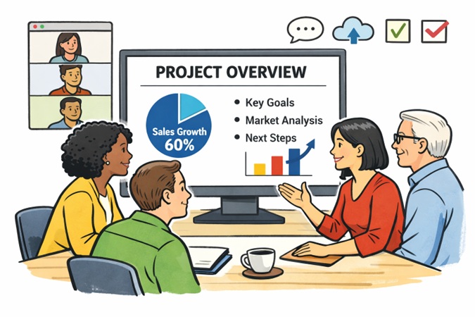
Modern teams are expected to deliver impactful presentations that reflect clarity, creativity, and efficiency. In a competitive, fast-moving business landscape, the combination of strong communication and strategic design can determine the outcomes of key meetings and collaborations. Harnessing advanced resources such as an AI presentation maker enables teams to streamline this process, making it easier to produce captivating, informative slides that resonate with listeners. Such tools help manage both the technical and creative aspects of smart presentation design, freeing up time for teams to focus on their core message. Team dynamics have evolved, with remote work and digital collaboration now the norm. This evolution brings new challenges but also unlocks opportunities to make presentations more inclusive and innovative. By understanding and incorporating modern design techniques, teams can significantly boost the effectiveness of their communications, foster greater engagement, and deliver stronger, lasting impressions. Audiences expect efficiency and aesthetic appeal, and adopting the right tools and tactics ensures a presentation stands out for both.
Adopting smart presentation practices is no longer the domain of design professionals. Anyone on a modern team can achieve visually striking results by leveraging accessible technology and easy-to-apply best practices. The journey toward more effective presentations begins with a commitment to simplicity, clarity, and inclusivity. By prioritizing both function and form, modern presentations become a strategic advantage. Whether pitching to potential partners, training internal teams, or informing stakeholders, strong design directly improves audience understanding and retention.
Embracing Minimalist Design
Minimalist presentation design is about focusing on what matters most and stripping away distractions. When a slide is free from clutter, the intended message comes through clearly, allowing an audience to absorb information quickly and easily. Using straightforward layouts, ample space, and a muted color palette will make content pop and prevent visual fatigue.
- Clear Fonts and Readable Sizes: Simplicity in font choices and sizing ensures audiences can read text without strain, even on smaller or distant screens.
- Ample White Space: White space functions as a natural divider, enabling key points and visuals to stand out, which aids in focus and comprehension.
- Consistent Color Palette: Limiting color choices creates harmony and fosters a professional appearance, while select accent shades help highlight important details.
Consistently applying minimalist design principles helps presentations maintain their visual appeal and accessibility. Presentation software and design templates can further support the minimalist approach, making it straightforward to align every slide with this philosophy.
Utilizing Bold Typography
Typography is a crucial visual tool in every presentation. Employing bold typography is not just about font weight but about guiding the audience’s eye toward critical points. Headlines, subheadings, and highlight quotes naturally draw in viewers when rendered with strong, clear fonts.
- Enhanced Readability: Oversized and thick letterforms let viewers process key statements quickly and ensure messages remain front and center.
- Improved Emphasis: Strategic use of contrast and scale in text makes the most important information unmissable and memorable.
- Modern Aesthetic: On-trend bold fonts can modernize presentations, aligning with contemporary brand guidelines or styles.
Choosing bold type for strategic content sections can transform a bland deck into a dynamic visual story. Balance is key, ensuring that boldness punctuates key areas without overwhelming the rest of the content. For best results, mix strong headers with clean, readable body text.
Incorporating Interactive Elements
Interactive elements engage audiences in ways passive slide shows cannot. Real-time content interaction, polls, clickable infographics, and embedded videos all build engagement and aid knowledge retention. Encouraging active participation fosters a collaborative environment and can transform presentations into two-way conversations. Interactive components make sessions memorable and increase learning outcomes. Presenters benefit from immediate audience feedback and can pivot in real time, making the overall experience more responsive and personalized.
Leveraging AI Tools
Modern presentation tools featuring artificial intelligence transform how teams approach slide design and content curation. These platforms handle layout suggestions, color harmonization, and even real-time editing based on audience reaction or presenter feedback. AI solutions can quickly generate slide decks from outlines and content, speeding up workflows and ensuring brand alignment. With AI-driven design, teams save valuable hours and reduce manual formatting. As these tools analyze content and audience data, they can adapt the look and feel of slides for maximum impact. The net effect is greater efficiency, fewer mistakes, and consistently professional results.
Ensuring Accessibility
Accessibility is essential for reaching all potential audience members, including those with disabilities. Clear fonts, high contrast color choices, and descriptive image alt text help ensure that visually or cognitively impaired participants can fully grasp the material. Consider adding transcripts or captions for any audio or video content embedded within slides.
- Use of Alt Text: All images and graphics should include descriptive alternative text that conveys their purpose or content.
- High Contrast Colors: The use of strong color contrasts helps content stand out, especially for those with color blindness or low vision.
- Readable Fonts: Steer clear of ornate or script fonts in favor of those that are clear and styled.
Incorporating accessibility best practices makes presentations more inclusive and demonstrates professional responsibility. Teams that prioritize accessibility broaden their reach and are better able to comply with modern inclusivity guidelines.
Modern team presentations can achieve higher engagement, retention, and inclusivity by integrating these design techniques. Minimalist principles, bold typography, interactive features, advanced AI tools, and inclusive practices come together to deliver presentations that drive results and delight audiences.
Conclusion
Effective presentation design combines clarity, creativity, and accessibility to maximize impact. Embracing minimalist layouts helps audiences focus on essential messages, while bold typography emphasizes key points and guides attention. Interactive elements, such as polls, clickable graphics, and embedded media, foster engagement and make sessions more memorable. Leveraging AI-powered tools streamlines the design process, ensures consistency, and allows teams to produce professional, polished slides quickly. Equally important, accessibility considerations, such as readable fonts, high-contrast colors, and descriptive alt text, ensure that all audience members can fully participate. By integrating these strategies, modern teams can communicate ideas more clearly, enhance audience retention, and deliver presentations that are not only visually compelling but also inclusive, efficient, and strategically effective.