Bottom sheets have become a cornerstone of modern mobile app interfaces, delivering supplementary information and actions while preserving the primary user flow. By effectively integrating bottom sheet UI components, designers can create intuitive interactions that keep users engaged and avoid abrupt context shifts.
Adopting the right bottom-sheet practices ensures users enjoy a fluid, accessible experience. From menu selections to actionable prompts, bottom sheets maintain screen continuity, letting users access details or options as needed. This approach, rooted in minimal disruption and maximum efficiency, contributes to higher satisfaction and better usability for all.
Striking the balance between visibility and simplicity is vital. Overly complex bottom sheets risk confusing users, while well-designed examples provide just enough information and interactivity without clutter. The design process must also account for accessibility features, so everyone can benefit from the added functionality and seamless interaction a bottom sheet delivers.
For teams aiming to elevate their mobile product’s usability, understanding how and when to use this UI element is essential. Designers should explore bottom sheets as a way to support secondary actions and context-driven content, rather than as general-purpose overlays or full-scale interaction surfaces.
Understanding Bottom Sheets
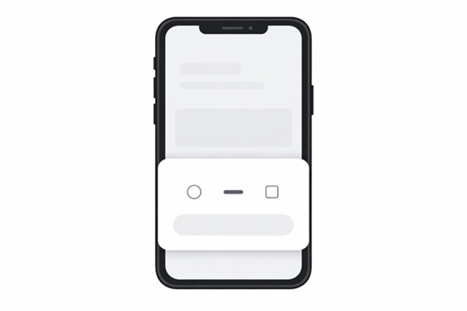
A bottom sheet is a user interface element that slides up from the bottom of a mobile screen, providing quick access to extra content or actions. Unlike modals or pop-ups that can dominate the interface, a bottom sheet is intentionally less intrusive, giving users a view of both the current screen and the newly presented options or details. This pattern effectively presents actionable content while retaining the user’s context within the app, a critical factor for keeping navigation intuitive and predictable.
When To Use Bottom Sheets
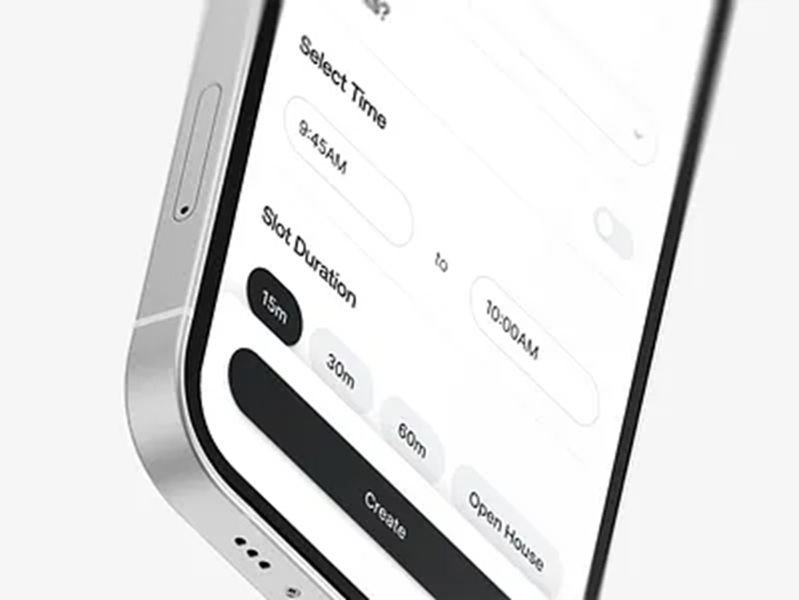
Bottom sheets are suitable for scenarios where supplementary or contextual details, settings, or actionable menus are required. For example, they are excellent for showing sharing options, quick settings, lists of contextual choices, or additional information tied to a selected item. Their role is to supplement the existing view rather than replace it, so users maintain orientation and understand that the primary content remains unchanged underneath.
- Presenting menus and secondary actions like sharing or editing options directly tied to the visible content.
- Displaying additional information or item-specific details without redirecting or fully transitioning screens.
- Enabling users to interact with supplementary inputs, such as action confirmations or form elements, in a non-intrusive way.
- Delivering prompts and quick notifications that require minimal interaction.
However, they are not meant for high-complexity workflows or tasks that require sustained attention, such as completing lengthy forms or multitasking. Instead, bottom sheets excel when assigned to simple, focused interactions that benefit from staying within the main view. For further guidance on UI design patterns, review the insights from Smashing Magazine’s patterns for mobile UI design.
Best Practices For Bottom Sheet Design
- Keep content concise: Use the bottom sheet to deliver direct, relevant information or tasks. Avoid including extensive lists, long text passages, or multi-step workflows.
- Ensure clear dismissal: Enable users to close the sheet by swiping down or tapping outside it. Include visual cues, such as a drag handle, to naturally hint at this capability.
- Align with brand and system guidelines: Match the look and feel of bottom sheets to the app’s style and follow established mobile platform conventions for consistency.
- Promote accessibility: Label all controls for screen readers and set focus to the appropriate control upon opening the bottom sheet. Use sufficient contrast and touch targets to help users with disabilities, and be mindful of keyboard users as well.
- Consider animation and transition: Use smooth transitions and animations to signal the sheet’s entrance and dismissal, guiding the user’s attention gently.
Common Mistakes To Avoid
- Overpacking with content: Including too many tasks or large sets of data complicates user choices and drains focus from the core task.
- Breaking interaction patterns: Bottom sheets should function identically wherever they appear in your app. Inconsistent behaviors, such as unreliable swipe or tap-to-dismiss, disrupt user trust and orientation.
- Neglecting accessibility: Failure to support screen readers, touch alternatives, or visual indicators creates barriers for users with disabilities.
To learn more about mobile accessibility standards, see the MDN Web Docs’ mobile accessibility checklist.
Real-World Examples
- Google Maps: Bottom sheets present place details and action buttons, such as “Directions” and “Save,” while still showing the map context. This enables users to take quick actions or read more about a place without losing their location view.
- Spotify: Utilizes a draggable bottom sheet for song details, playback controls, and playlists. As users browse content, they can expand or collapse the sheet, enabling seamless management of now-playing music without switching screens.
Conclusion
Bottom sheets embody an effective UI practice for surfacing quick actions and supplementary content while supporting a fluid user journey. By prioritizing clarity, accessibility, and consistency, teams can maximize the benefits of this UI pattern. Bottom sheets, when properly implemented, provide a foundation for efficient, enjoyable, and modern mobile app experiences.